网页设计
16个非常有用的前端CSS框架
互联网发展到今天。网页是设计风格渐渐走向几个特点。一种是创意类而另一种就是框架类。创意类的网页是让网页更趋向于艺术风格,而框架类的网页则是为了加快网页设计的开发速度以及各种标准化的统一管理。好的团队都会用一种高效的框架来进行快速开发。这样的工作效率会非常的高。更牛的团队会相应的开发自己的框架,或者对一些开源框架进行二次定制修改来更大程度的发挥效用。今天我们要分享给大家的是网页前端的框架。你会发现用这些框架会大大加快你的开发速度和开发的统一性。你一定会爱上他们里面的一个甚至是几个的。
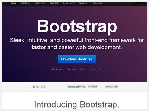
Sleek, intuitive, and powerful front-end framework for faster and easier web development.

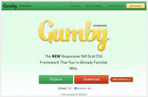
Create rapid and logical page layout and app prototypes with Gumby Framework, a responsive CSS framework based on the 960 grid you already know.
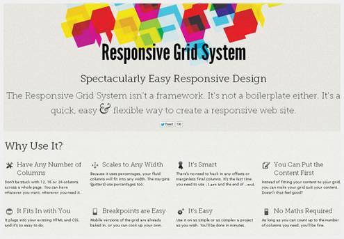
This is the Responsive Grid System, a quick, easy and flexible way to create a responsive web site.
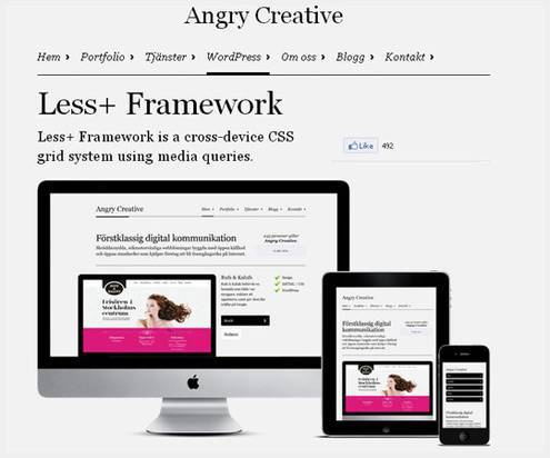
Less+ Framework is a cross-device CSS grid system using media queries.
Simple CSS framework for fast, intuitive development of responsive websites. Built using the ‘Mobile First’ approach, ‘clearfix’ for clearing floats, box-sizing: border-box for adding additional padding to elements, and weighs less then 1kb compressed. Responsive design isn’t hard, you’ve just never used responsive.gs.
Set column and gutter widths, choose the number of columns, and switch between pixels and percentages. All without any .grid_x classes in your markup. Oh, and did we mention it’s responsive?
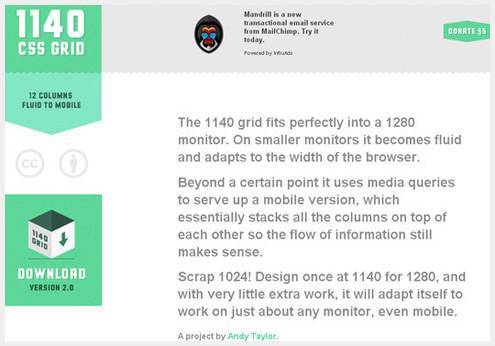
The 1140 grid fits perfectly into a 1280 monitor. On smaller monitors it becomes fluid and adapts to the width of the browser.
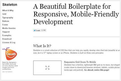
Skeleton is a small collection of CSS files that can help you rapidly develop sites that look beautiful at any size, be it a 17″ laptop screen or an iPhone. Skeleton is built on three core principles:
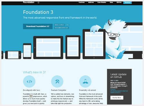
The most advanced responsive front-end framework in the world.
Golden Grid System (GGS) splits the screen into 18 even columns. The leftmost and rightmost columns are used as the outer margins of the grid, which leaves 16 columns for use in design.
A CSS framework for responsive web designs.
Ingrid is a lightweight and fluid CSS layout system, whose main goal is to reduce the use of classes on individual units. Making it feel a bit less obtrusive and bit more fun to reflow for responsive layouts.
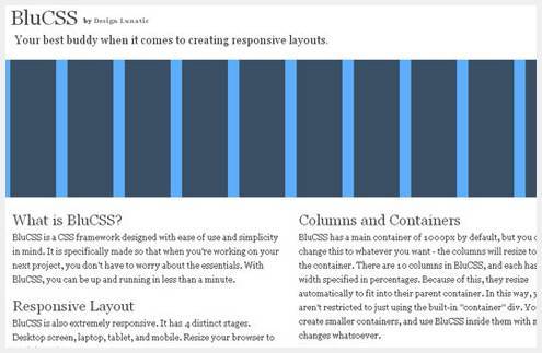
BluCSS is also extremely responsive. It has 4 distinct stages. Desktop screen, laptop, tablet, and mobile. Resize your browser to see it in action.
Gridless is an optionated HTML5 and CSS3 boilerplate for making mobile first responsive, cross-browser websites with beautiful typography.
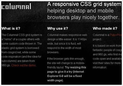
A responsive CSS grid system helping desktop and mobile browsers play nicely together.
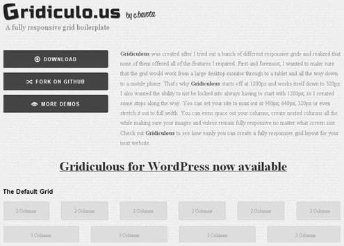
Gridiculous is an HTML5 responsive grid boilerplate that can take your site from 1200px all the way down to 320px. Make you site look great on desktop browsers, tablets and handheld devices.

本文由 Jackchen Design 1984 作者:jackchen 发表,转载请注明来源!
