网页设计
70+优秀的Tumblr主题
著名的轻博客Tumblr成立只有四年时间,但是该网站托管的博客数超过了已有八年历史的WordPress.com。一月份时Tumblr上有700万个独立博客,到目前为止,该网站上的博客计数器显示已有20873182个博客,比WordPress.com上的博客数「20820425」大约多出了8.5万个。虽然WordPress.com的计数器中没有计入通过WordPress.org自己搭建的Wordpress博客。但对于一家成立只有四年的网站来说,Tumblr的发展速度仍值得刮目相看。最近Tumblr用户增长速度很快。另外一些娱乐、新闻和时装界的知名公司也开始入驻Tumblr,并且他们使用Tumblr的方式和使用WordPress.com的方式截然不同。五月份,Tumblr创始人David Karp在博客中说Tumblr日PV达到了2.5亿,09年时这还是Tumblr一个月的PV,而今天,另一个数字更让人震惊。Tumblr董事长John Maloney在博客中说,Tumblr现在每个月的PV达到了84亿,一个月前这个数字还是70亿,如果你看一下Quantcast的公开数据,Tumblr的增长就像火山喷发一样。
Tumblr十分看重可定制性及易用性,所以注册/登录页面极为简洁。用户可以向他们的Tumblr添加七种类型的内容。Tumblr主要的页面是“Dashboard”,显示所有跟随用户的更新。在这个界面上用户可以将某篇文章标注为喜欢或是转发,这些都和Twitter很类似。Tumblr的用户体验因此也非常好,85%的注册用户都留在了Tumblr,远高于Twitter的40%。除了在Tumblr网页上发布内容,Tumblr还支持通过小书签,电子邮件,AIM聊天机器人,甚至是拨打Tumblr的电话来更新。此外Tumblr可以自动将内容同步到Facebook和Twitter。Tumblr可以绑定域名也是它的一大亮点,使得用户可以在自己的域名下发布文章。当然轻博客如此受到大家追捧自然也少不了一些模仿者。我们知道的新浪已经开始了微博客的推广。可以想象不久之后Tumblr或许也将变成无.法.访.问的结局!下面是70多个优秀的非常棒的Tumblr主题,他们有免费的也有收费的,你能从中发现轻博客的主题似乎确实有那么一点轻灵的味道!置于他会不会成为未来网络的主流?!就让我们拭目以待吧。
Free themes
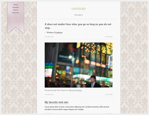
Imperial
Imperial is a feminine theme with a patterned background and flag detailing. It’s a fairly narrow theme, with a lavender color scheme.
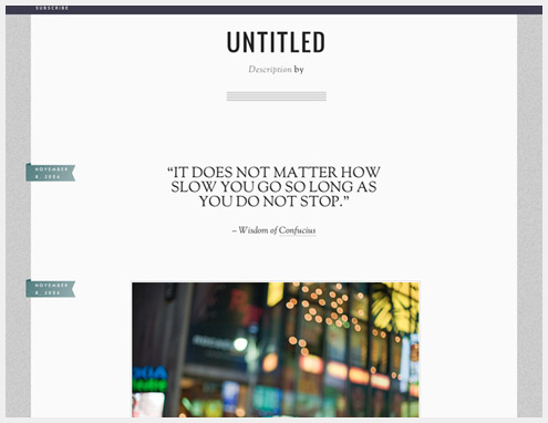
Ernest
Ernest has an almost corporate look, with textured granite background and a conservative color scheme. The typography is much more readable than many themes.
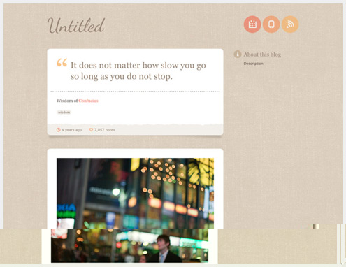
Miss Sourpuss
Miss Sourpuss has a linen background, rounded corners, and accents in shades or orange. It’s a subtle, understated theme with great typography.
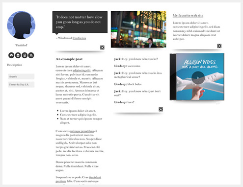
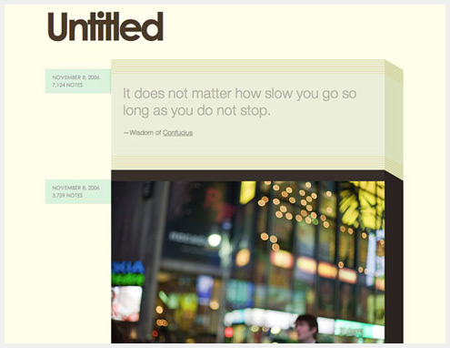
Boxes
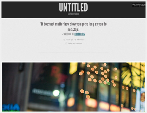
Boxes is very well-suited for image-heavy tumblogs, though it also works for those with more text posts. Shadow details make it unique, while the grid-based layout adds structure.
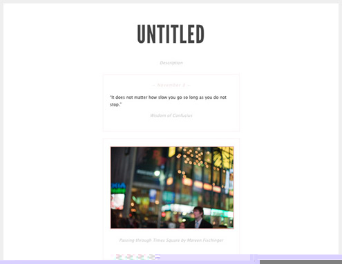
Lines
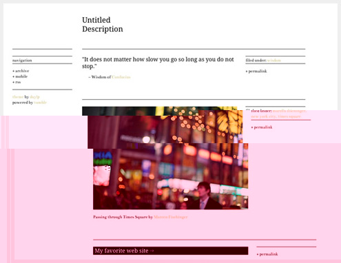
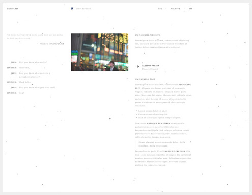
Unsurprisingly, Lines has a ton of line details. The design is minimalist, with good typography and a muted color scheme.
Solstice
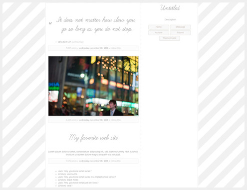
Solstice has a muted striped background, handwritten script typography, and a gray and white color scheme. It’s a very understated theme.
Stacky Pro
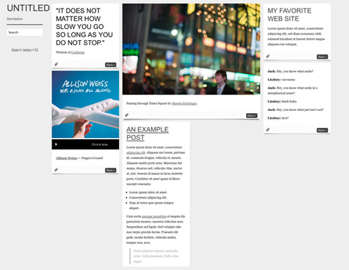
Stacky Pro has a stacked grid layout, with columns that reposition themselves based on your browser width.
Sam’s Theme
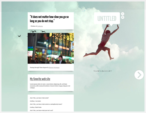
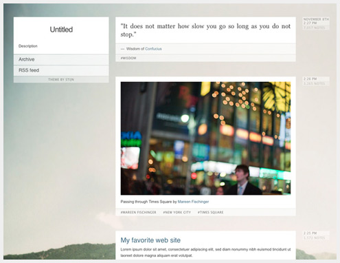
Sam’s Theme has a large photo background and understated typography. The muted colors of the background give it a retro feel.
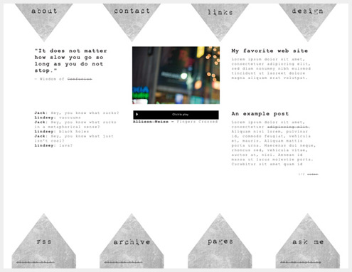
Native Citizens
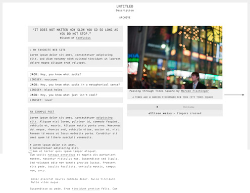
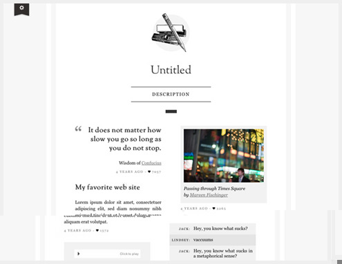
This is a simple, minimalist theme with two content columns, a monospaced font, and a gray and white color palette.
Retro Candy
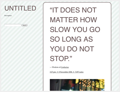
Retro Candy has oversized typography, rounded corners, and a muted stripe background.
Serifs & Scribbles
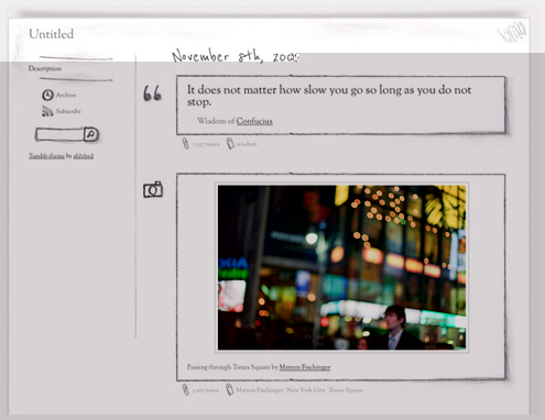
Serifs & Scribbles has a pencil-drawing look to it, with custom icons for each post type. It even includes a hand-drawn search bar and RSS feed logo.
Effector Theme
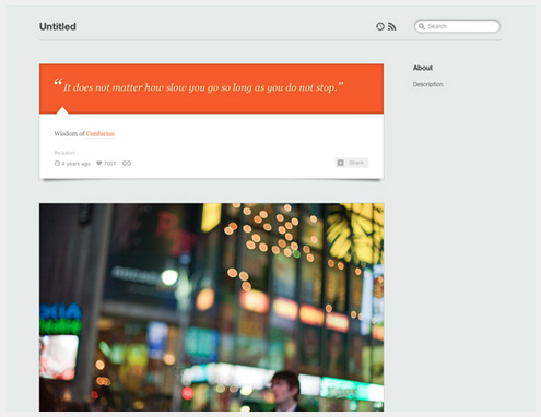
The Effector Theme comes in two color schemes (light and dark). The shadow details and thought put into each post type sets it apart from many other free themes.
Boston Polaroid
Boston Polaroid is perfectly suited to showing off large images (which resize based on the browser viewport size). It has a muted gray color scheme and a subtle textured background.
Megapixels
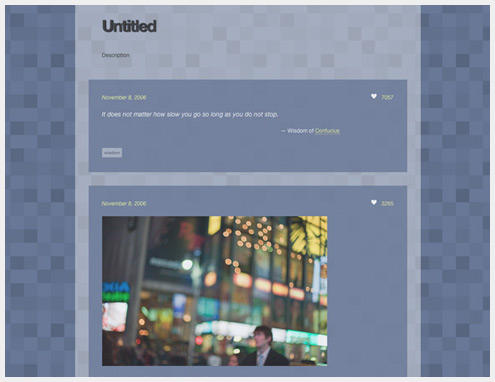
Megapixels has a dark lavender pixelated background and transparency effects.
Lightweight
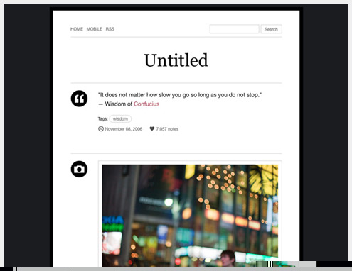
Lightweight is a minimalist, dark gray and white, one-column theme. It includes round icons for each post type and very readable typography.
Centennial
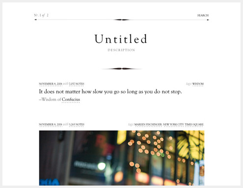
Centennial is a simple black and white theme with a very formal, traditional look despite its minimalist aesthetic.
Legrand
Legrand is a retro-modern theme with muted colors and 3D effects. The thin sans serif typeface used for everything but the header is quite stunning and gives the design a mid-century modern feel.
Yay, Hooray!
Yay, Hooray! is a very narrow, minimalist theme with rust-colored accents.
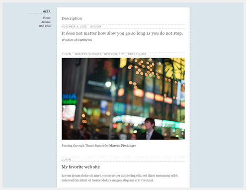
Descriptive
Descriptive is a minimalist theme with a light blue background and dashed line details.
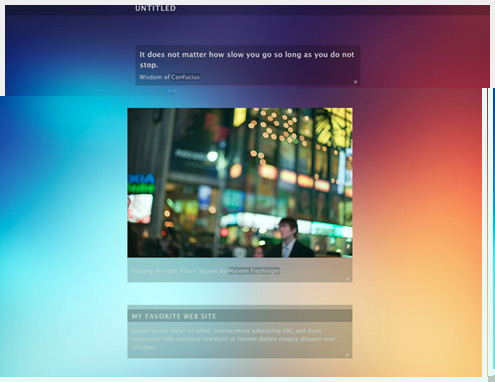
fluidMod
fluidMod uses transparent post backgrounds over a large, multi-colored background image. It’s an understated theme that still packs a lot of visual punch.
Peach
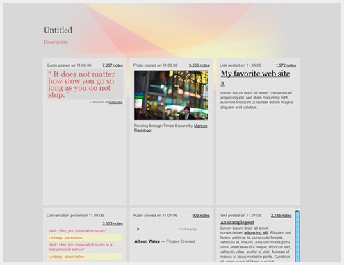
Peach is a mostly-gray theme with pink and pastel orange accents and header image. It has a three-column grid layout.
Phobic Man
Phobic Man has a blue color scheme with orange accents and rounded corners. Flag details and shadow effects set it apart from the competition.
Significance
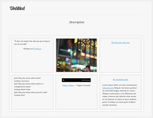
Significance is a gray and white grid-based theme that’s perfect for portfolio or other image-heavy sites.
Pulp
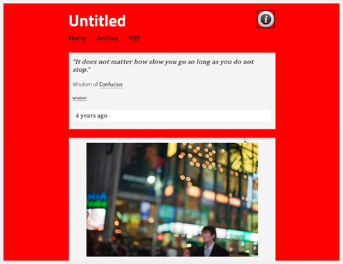
Pulp has a bold red background, and simple gray color scheme for everything else.
Punch of Intuition
Punch of Intuition has a large photo background, and simple gray and white color scheme otherwise. Line detailing on the posts and in the sidebar add an extra bit of polish.
The Stitch
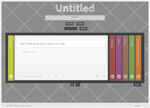
The Stitch uses hand-drawn elements and an accordion slider for displaying posts. The basic gray color scheme is offset by brightly colored post type banners.
The Curator [Beta]
The Curator is best suited for photo and video posts, due to the typography being incredibly tiny for everything else. It’s a great minimalist theme, though, with a textured background.
go CRAZY!!
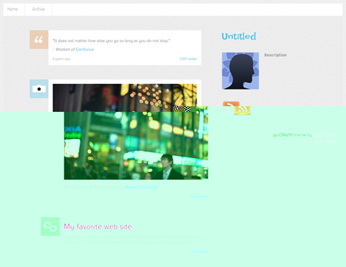
go CRAZY!! uses web fonts and multi-colored accents against a gray background.
Surreal
Surreal is a minimalist gray theme with a lightly textured background and shadow details behind each post.
Mellow Yellow
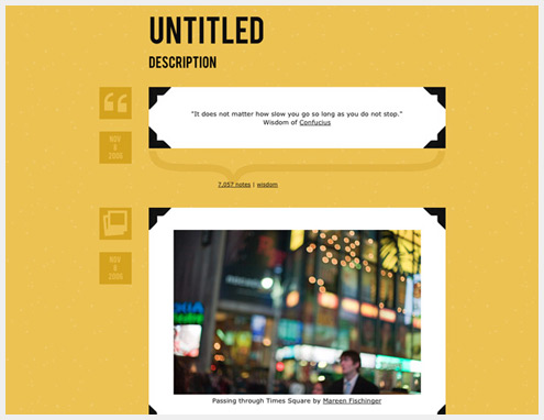
Mellow Yellow is a bold, retro-styled theme with photo corner accents on each post and a textured background.
Hobo
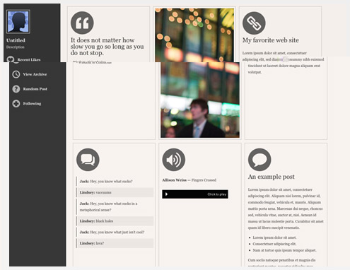
Hobo is a grid-based theme with content columns that shift depending on your browser width. The warm gray color scheme and round post type icons are unique.
Firsts
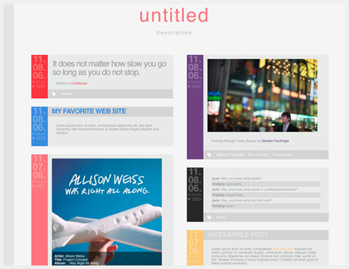
Firsts is a multi-colored grid theme with two columns and a gray background.
Inkhorn
Inkhorn is a modern theme perfectly suited for text posts. The two-column layout is a bit unexpected for the overall style.
Luxury Notes
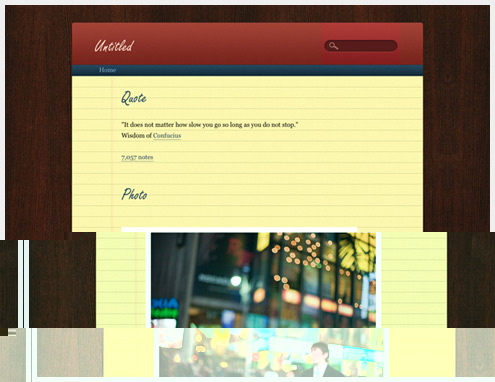
Luxury Notes is a notepad-styled theme with a yellow lined paper content area background and a woodgrain main background.
Grunge Era
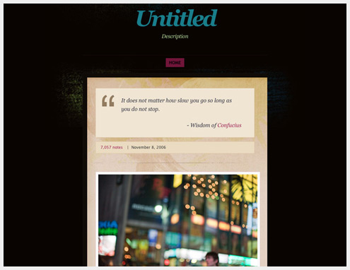
Grunge Era is a grungy single-column theme with lots of textures and multi-colored accents.
Luminescence
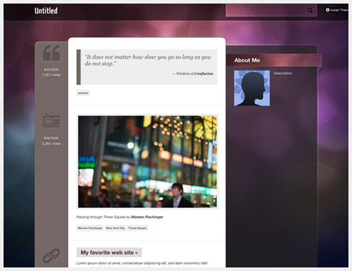
Luminescence has a multi-colored bokeh background and a transparent sidebar. Letterpress effects for the post icons are a nice touch.
With Style
With Style has a multi-colored noise-filled background and hard shadows behind each post. The header includes a letterpress effect behind the text.
Impaler v.2
Impaler has a grungy look, with animated menus that become blood-soaked in their hover state.
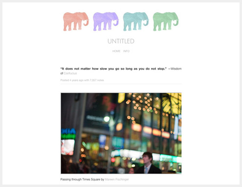
The Elephant in the Room
The Elephant in the Room has a minimalist design with four elephants in the header.
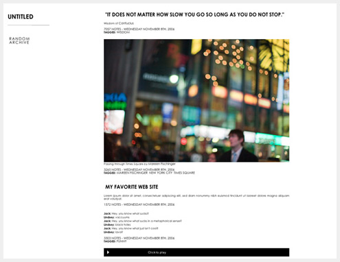
Clean & Simple
Clean & Simple is an apt name for this theme. It has a minimalist design with bold sans-serif typography.
Revista
Revista is a grid-based theme with a gray color palette and excellent typography.
Premium themes
Nautical ($49)
Nautical has an antique look, with bespoke textures and woodcut illustrations. It includes unique post illustrations and Disqus comments integration.
Vintage Scrapbook ($49)
Vintage Scrapbook includes distressed typefaces and a vintage look and feel. It also has a highly-customizable sidebar area.
Stockholm ($49)
Stockholm has a minimalist look and is designed to work well with blogs that are heavy on images. It includes subtle patterns and simply typography, and also has support for Disqus comments and Typekit integration.
Zurick ($49)
Zurich was designed specifically for people who love Helvetica. It includes meta data that fades in and out as visitors scroll, as well as social media links.
High Res Theme ($19)
High Res is a very minimalist theme with automatically resizing images. It takes advantage of larger screen sizes and browser viewports, both for photos and video.
Etcetera ($19)
Etcetera is a hand-made premium theme that combines real and graphic elements in a scrapbook/collage style. It’s easily customizable and supports Disqus comments.
Leica ($49)
Leica is a gallery/portfolio theme with four columns of images. It’s perfect for photographers, illustrators and designers. It includes customizable link, title, and navigation colors, and a special layout for custom pages, among other features.
Antiquity ($9)
Antiquity has a muted color scheme and surprisingly modern look. It includes custom fields for Twitter and Flickr, as well as support for Disqus comments.
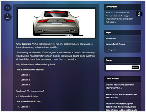
Depth ($19)
This blue and purple theme from Obox includes transparency effects and a modern design. It also has support for Disqus comments, Flickr stream integration, and custom page templates.
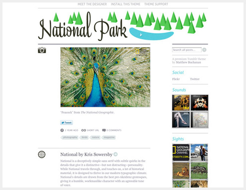
National Park ($19)
The National Park theme has a retro-inspired clean design, with a great header and typography.
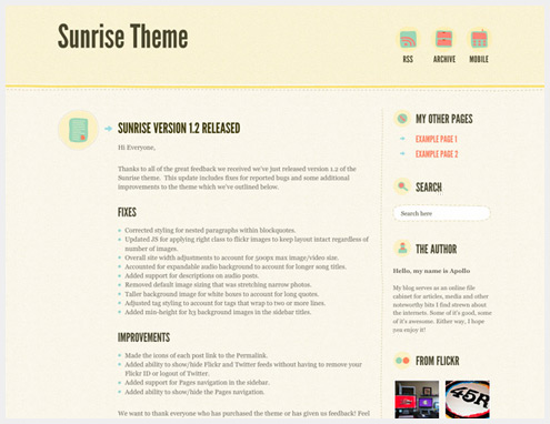
Sunrise ($49)
Sunrise has a hand-made style but a simple design, with a mostly-pastel color scheme. It includes hand-drawn icons for each post type, as well as support for Disqus comments.
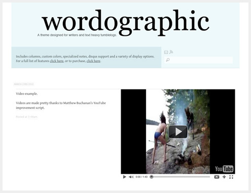
Wordographic ($9)
Wordographic is a theme specifically designed for text-heavy tumblogs. It has a focus on beautiful typography, as well as some interesting post formats (the Quote post is especially well thought-out).
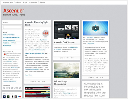
Ascender ($49)
Ascender comes in both dark and light varieties, and is built on a flexible grid. You can also customize the color scheme, add Typekit fonts, and choose between two different post sizes (250px or 400px).
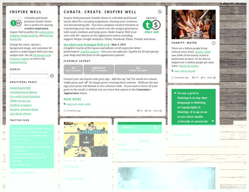
Inspire Well ($49)
Inspire Well is a flexible grid-based theme with customizable colors, background image, and more than 30 other options. It also has three different post sizes (1, 2, or 3 columns wide) that are easy to activate with tags.
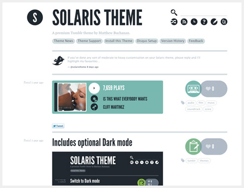
Solaris ($9)
Solaris is a minimalist theme with lots of circular graphics. There’s also an optional dark color scheme.
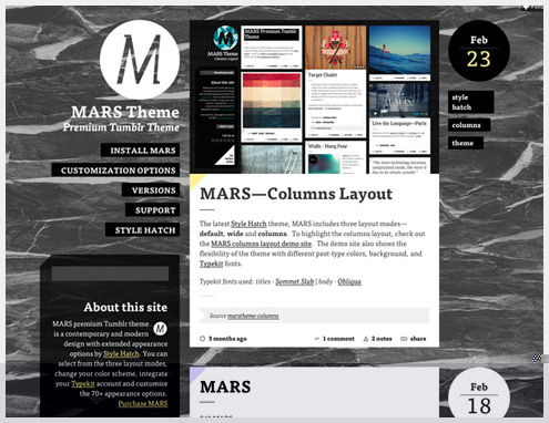
MARS ($49)
Mars has a large background image and three layout modes (default, wide, and columns). Mars is also Typekit ready, includes social features, and has many other customization options.
Savory ($49)
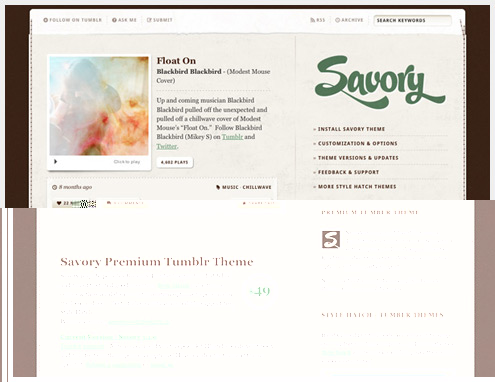
Savory has a slightly grungy feel, with textures and stitching detail. It’s Typekit ready, and includes color customizations and a customizable background image.
Paris Nights ($49)
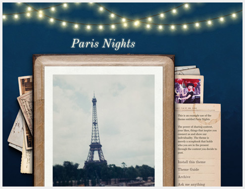
Paris nights has a beautiful collage style layout, complete with lighting effects in the header.
Rank & File ($49)
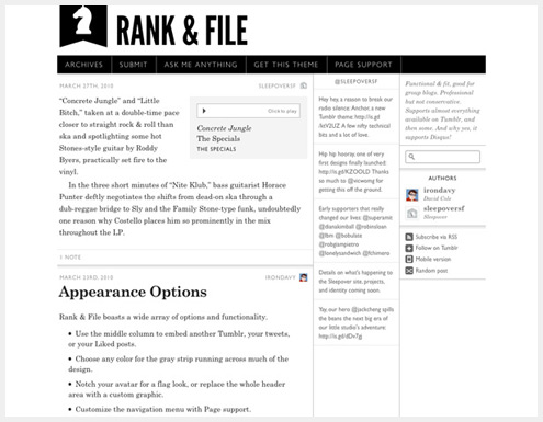
Rank & File is a clean, modern theme with a more traditional blog layout than many Tumblr blogs. It includes a number of theme customization options, including color options and a customizable header image.
Pixelated ($18)
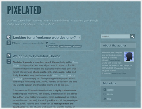
Pixelated is a simple theme with a graphic, pixelated background. All post types are supported, and CSS3 features are also integrated (including web fonts).
Meteoro 2028 ($15)
Meteoro 2028 is a robust, minimalist portfolio theme that has support for both images and video (YouTube and Vimeo at the moment). The color scheme can be fully customized, and it includes a custom slideshow for photosets.
Gallera ($15)
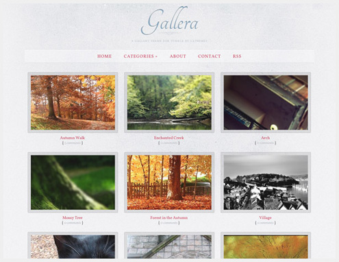
Gallera is an elegant gallery theme with a subtle, grungy textured background. It’s great for designer, artists, and photographers who want to use Tumblr for their portfolio.
Boxxed ($10)
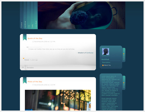
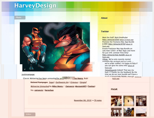
Boxxed has a modern, colorful style and includes Twitter and Flickr integration in the sidebar. It has a transparent background for easy color changes, as well as support for all post types.
Desire ($17)
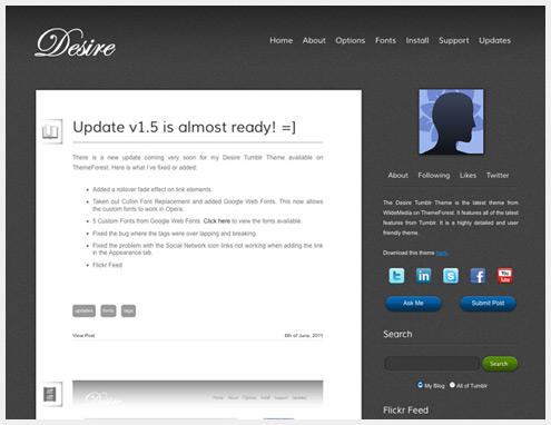
Desire is a dark, minimalist theme with support for all of Tumblr’s newest features. It also includes an array of jQuery effects and custom typography.
Polaroid ($12)
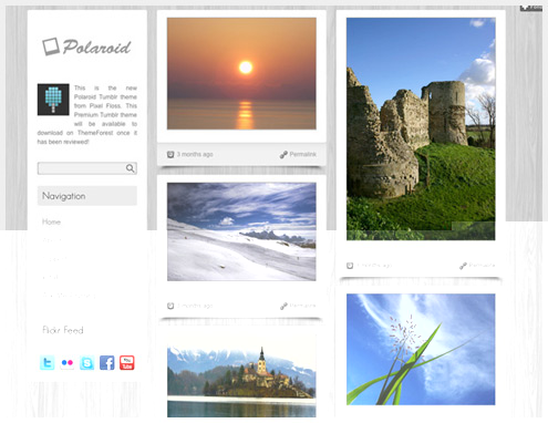
Polaroid is an easily-customizable theme with a clean and modern look. The background image, link colors, sidebar and other features can all be changed to suit the look you want.
Gothic Dream ($12)
Gothic Dream is a dark theme with gothic styling. The background can be customized (image or color), as can the fonts, and colors of links and other elements.
Cherry ($11)
Cherry is a very girly theme, well-suited to personal Tumblogs. The color scheme is made up mostly of pastels, with simple icons for each post type and a patterned background.
Fanfarron ($10)
Fanfarron is a very elegant theme, with an understated background. It includes a number of customization options, Disqus comments, and a Flickr widget.
Vintage Sky ($20)
Vintage Sky has a muted color scheme and a pretty Fail Whale illustration in the header (with cloud animations). You can customize the background image, header image, and many other aspects of the theme.
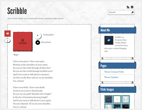
Scribble ($9)
Scribble is a hand-drawn theme with a crumpled paper background texture. Unlike many hand-drawn designs, though, it has a very structured look, as if a straight-edge had been used in the drawing process (unlike the organic lines of most designs of this style).
Nova ($49)
Nova has a clean grunge look, with paper-like accents and three color schemes. It includes nearly 50 appearance options, two layout modes (standard two-column and wide one-column), and customizable colors and background and header images.
本文由 Jackchen Design 1984 作者:jackchen 发表,转载请注明来源!

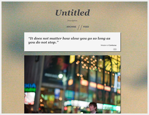



I'm using Sam's theme right now, such a great background 😉
收集了这么多,花了少时间吧