网页设计
网页设计之20个优秀的表单设计
我们在浏览网站经常会遇到各种各样的表单,可能是用来填写你的个人信息,也可能用来相互留言的。所以在网页设计师架构网站的时候,这一方面也是相当重要的,因为这里和浏览者是直接互动的。如何设计的有创意,设计的更人性化,至关重要!下面是我们收集到的20个优秀的表单设计,你可以从中找到想要的灵感。
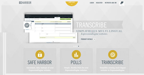
EEHarbor
EEHabor offers ExpressionEngine goods, so forms are probably their expertise.
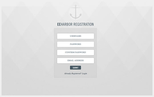
The website itself is really beautiful and clean. The register form is clean, beautiful and straight forward, it is certainly a form that will not scar you away.
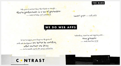
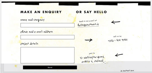
Contrast
Contrast is a web apps developer. Their website is pretty unique and nice, good usage of typography, colors and shapes. The contact form is also pretty unique and fun.
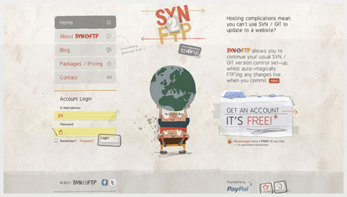
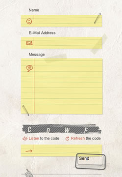
SVN2FTP
SVN2FTP is a hosted source control system. The website has a nice fun approach and a beautiful texture. The contact form is also nice and different from usual.
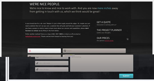
Ally Creative
Ally Creative is a small creative company. Their website is clean and have a nice textured background, the contact form is also pretty nice.
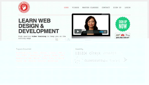
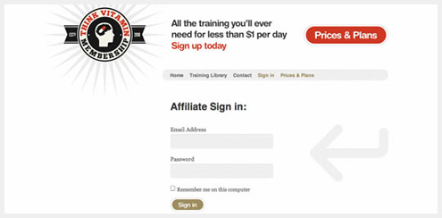
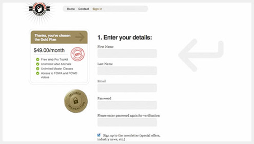
Think Vitamin Membership
Think Vitamin is a nice place to watch videos to learn web design and development. Besides having a nice website, all their forms are beautiful and pleasant.
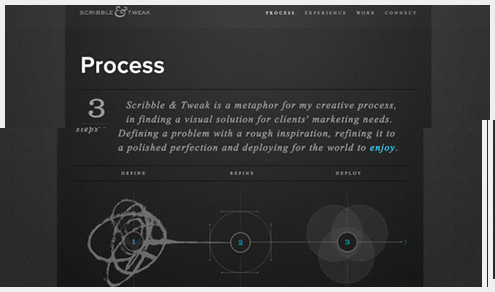
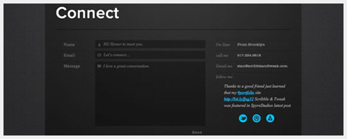
Scribble & Tweak
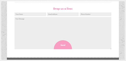
A beautiful and neat single page layout that holds a nice and easy contact form.
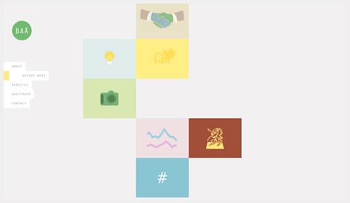
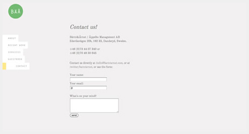
Barnt & Arnst
I know I already showcased this website in previous lists, but I really like its colors and simple layout. And they deserve and extra point for their super clean contact form. ![]()
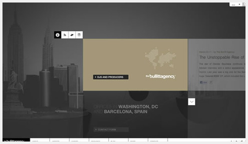
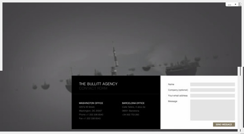
The Bullitt Agency
Nice website layout based on shades of black, gray and some beiges. Beautiful background images and classic contact form.
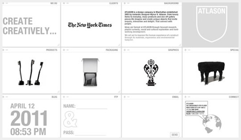
Atlason
Clean and beautiful layout with “built in” forms for FTP and email.
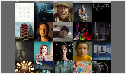
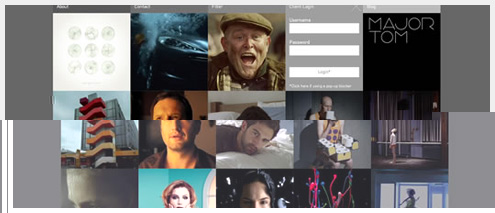
Major Tom
Nice image based layout with a “hidden” sign in form for clients.
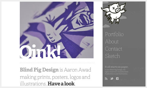
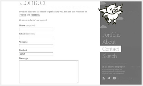
Blind Pig Design
Their website is really cool. And as for the contact form, pretty classic and clean. Also loved the subject detail from the contact form – Oink!
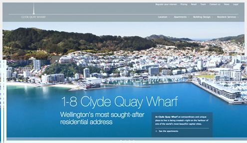
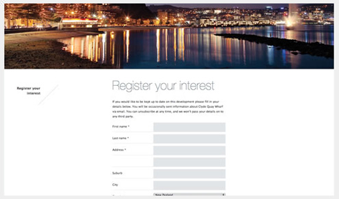
Clyde Quay Wharf
A residential project from New Zealand with a layout based on beautiful background images and elegant type choices. The “register your interest” form is pretty clean and beautiful.
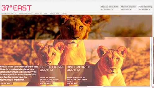
37 East
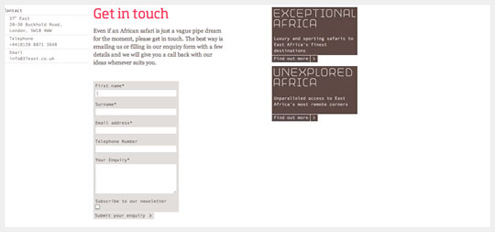
If you are thinking about doing the real African Safari, you should check out this website. The layout is based on really beautiful background images and interesting typography.
Michael Freimuth
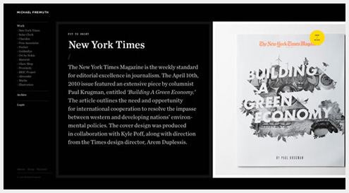
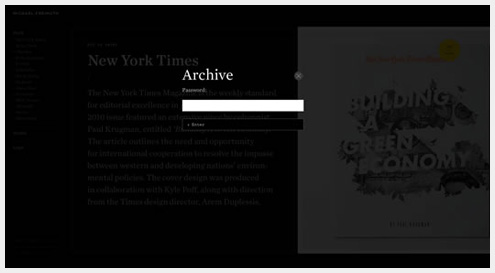
Michael Freimuth is a art director and illustrator. His website is pretty simple and cool. The login form to browse archives is also really nice.
Social Design House
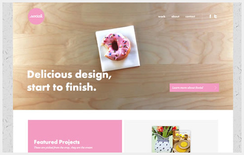
Their website has delicate colors combination and a good choice of typography. The contact form is also pretty beautiful.
Tinkering Monkey
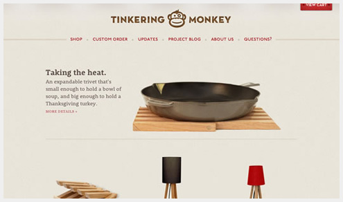
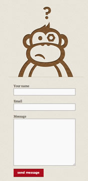
Besides having some pretty stylish products to sell, Tinkering Monkey has a super clean layout. The contact form is also pretty neat.
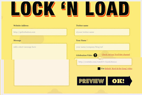
Go Live!
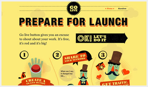
Need a button to shout about your work? Try this! Go Live has a pretty colorful layout and their “let’s do it form” is also really nice.
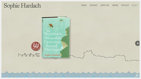
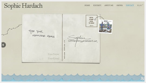
Sophie Hardach
A cool single page layout for a book website. Contact form really unique.
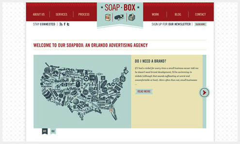
Soapbox
Simple layout with a beautiful color scheme.
RxBalance
Beautiful watercolored layout with texture background. Delicate colors and typography. The contact form is also really elegant and simple.
本文由 Jackchen Design 1984 作者:jackchen 发表,转载请注明来源!
