设计创意
40个出色的插图网站设计

将视觉元素添加到你的网站设计中,可以让你的站点脱颖而出。虽然插图需要花很多时间,才能产生效果,但结果往往是一个惊人的网站设计,可以很大程度的影响你的读者。下面的例子展示了40辉煌的网站设计来帮助和激发你的下一个设计作品。
1. Morphix
This site mixes a creative blog layout with nice illustration to create a blog design that is very untypical, but very memorable.
2. PSD to WP
Here is a one page site that uses a powerful background image to build its sites personality and brand off of.
3. Dedoce
This underwater scene has a bit of a grunge feel to it that helps keep it from looking like another vector illustrated website.
4. Chirp
Designed entirely with the hand drawn style in mind, Chirp has an artistic style that is very much its own.
5. Olive Crush
These guys use a simple illustration and textures to help add some personality to the site design.
6. Ready Made Designs
A nice color scheme and illustrations make this website very easy on the eyes.
7. Bird Boxx
A large illustration on this website easily translates that sites name to help make it more memorable.
8. Cool Brush Design
This sit sports a very detailed graphic of a castle and ocean scene that works with Flash.
9. Katherine Designs
Who doesn’t love a site with robots? This site sports a pastel color scheme and lots of little robot illustrations.
10. Arbel Designs
A very cool one page portfolio site. Click around on the navigation here to see all of the various levels of the design.
11. Synch Media
A combination of unique colors, layout, and illustration make this website very unique and different.
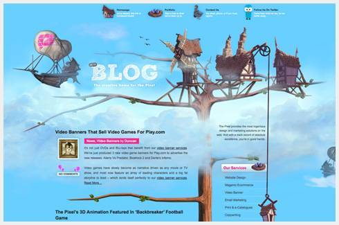
12. The Pixel
Simple animation, outstanding artwork, and clever layout; this website has it all.
13. Andy Adventure
One would expect that animated games would have a bold and artistic website. While this isn’t the most clever design, it is certainly big and bold.
14. Los Colores Olvidados
If Tim Burton were a web designer, I would think that his website would look a little something like this.
15. Store Envy
Here is a site that mixes very modern user interface style with some bright and colorful illustration work.
16. Digital Impact Outdoors
The illustration in this website design does an excellent job at conveying the overall message of the website and adding to its value.
17. Vindem Teren
I’m not really sure what this site does, but based on the illustration it looks to be some sort of real estate based site. Goes to show you that images can speak volumes.
18. Branded 07
This site is full of outstanding illustration. Be sure to check out the footer area on this one.
19. Pralinen Schachtel
I like that the illustration on this site has made sure to create some depth to the picture. This is something many vector illustrations lack.
20. Indofolio
This is a must see side scrolling site. Aside from the amazing artwork, it also has a nice transition from page to page to helps added to the feel of the site.
21. Camellie
Creating a clever and artistic website is easy when you have as much talent as Camellie does. If only we were all this talented.
22. Bet Your Followers
I don’t really get the point of this website, but it shows very creative use of some excellent stock illustration work.
23. Attack of the Web
This is one of those websites that just make you wonder where they got the idea from. This is a clever and funny one page layout.
24. Blossoms Village
While not the greatest looking website on this list, it just goes to show that some bold illustration work can go a long way in making your design look even better.
25. Outlaw Design Blog
It is all about the little details in this site. The gun in holster on the menu, random bullet holes, and other touches help make this site a bit different.
26. Abduction Lamp
This site even comes in 3D! Well, not really, but it’s still a clever aspect of the design.
27. Bimbi Sicuramente
I have no idea what this site is about, but I like that the vector illustration is full of texture and offers a bit of depth to it.
28. GREPIT
This site offers a very slick and clever looking diagram type illustration to convey what it is they do.
29. Kidd 81
Here is another site with a style that stands out from the crowd and one that the designer has used to brand them self very well.
30. Atomic Cartoons
This is just an amazing website and probably my favorite on this list. You MUST check this site out and click around a bit.
31. Somos La Peralimonera
I always like it when illustrated sites like this have multiple layers to them. Adding outer space or underground layers is a cool idea.
32. HD Live 09
Any time you can add some real hand drawn work to a design you are sure to create something very different from anything else out there.
33. Piipe Online
A nice use of bold colors, creative layout and interesting use of patterns make this site fun to look at.
34. Blogsville
A basic website with a simple illustration to help conceptualize the conference name.
35. Tech Adventure DC
Again, any time you can add some hand drawn elements into your design you are sure to create something outstanding.
36. Open Atrium
Here we get a nice mixture of typical clean web design mixed in with some bright and bold illustration work.
37. Black Moon Development
Bring in a more traditional illustration look offers a unique style in today’s web design.
38. Moshi Monster
As one would epect, this online kids game is full of animation, cute little monsters, and plenty of bright colors.
39. Carreras Con Futuro
This site might be “drawn” and “painted” with Photoshop brushes, but it still has that hand drawn style to it. Great for those of you who don’t have the traditional artistic skill set.
40. Toris Eye
This is a very cool site that you have to see to really appreciate. It offers simple motion, creative ideas, nice colors and oh so much more.
本文由 Jackchen Design 1984 作者:jackchen 发表,转载请注明来源!


