网页设计
网页设计中背景大图的使用
随着互联网的浪潮,我们生活在发生着最最本质的改变。从最开始用电话线上网,听着拉长有规律的拨号声,满怀期待!到现在光纤的不断提速。让很多技术瓶颈都不在是瓶颈,让很多问题不在是问题。对于网页设计师来说,终于可以长长的舒一口气。用上像素高一些的图片。甚至可以让最爱的整张图片作为网站的背景来排版使用。这对于过去是不可想象的。而今却是流行风格中的一类。今天我们就搜集分享了一批运用大图作为网站背景来使用的站点。希望这些网站能真正带给你一些创意和新的灵感。去设计出更加完美的网页来。
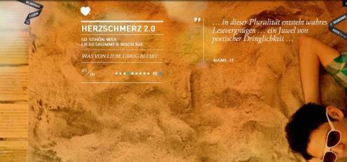
Herzschmerz 2.0
Herzschmerz 2.0 does a great job of using a number of large images throughout the site all the while maintaining a clean minimalist look.
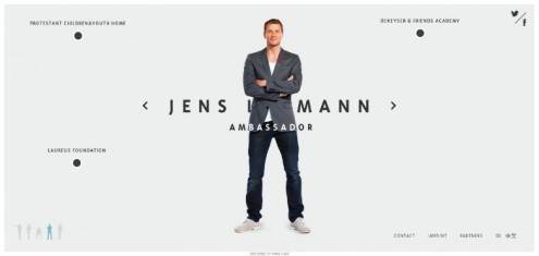
Jens Lehmann
Jens Lehmann uses a large photo of himself as his background giving the site a level of personalization. Users can get a sense of who he is.
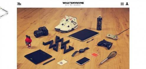
Whatsmynvame
Whatsmynvme uses a large gridded image not only as the background, but they make each piece of the grid into a different link in their portfolio. Clever execution of the concept overall.
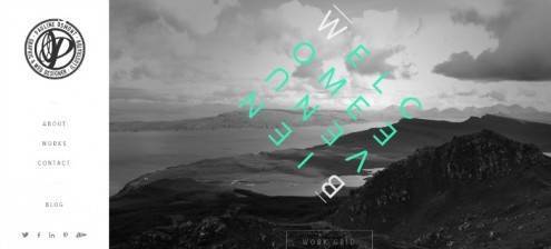
Pauline Osmont
Pauline Osmont uses beautiful, clean background images with creative use of typography and geometry layered on top of them to create a clean but very visually stimulating site.
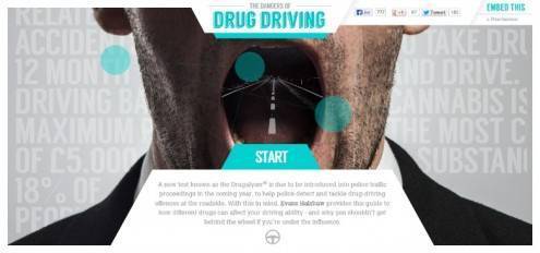
Dangers of Drug Driving
The Dangers of Drug Driving site uses large background images through the dashboard of a car to convey what it’s like driving on various controlled substances. Very tongue-in-cheeky and playful in their delivery.
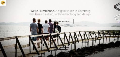
Humblebee
Humblebee uses large, strong imagery fully filling the background of the site with small bits of minimalist typography for a clean bold look that just works.
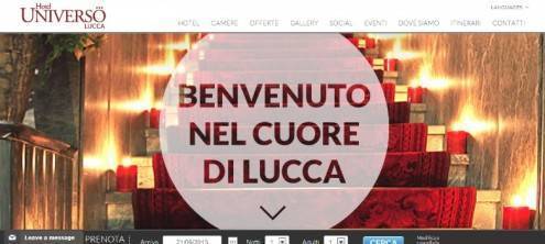
Hotel Universo Lucca
Hotel Universo Lucca makes use of large, full color background images to show off the beauty of their establishment. Keeping the brand at the forefront of the site.
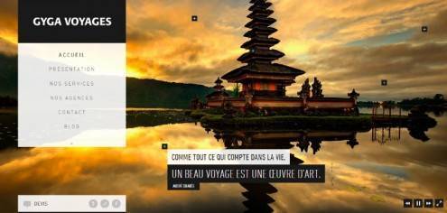
Gyga Voyages
Gyga Voyages uses this same technique to show off the gorgeous places you can visit around the world via their specialized travel services. Working from the mission that a good journey is a work of art, their site sells this idea with perfect tone and style.
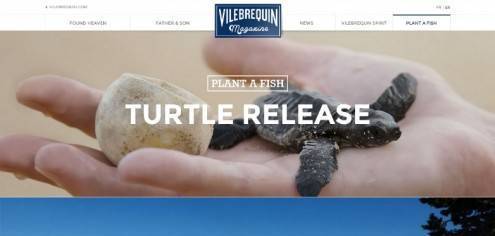
Vilebrequin Magazine
Vilebrequin Magazine uses its entire front page as its main menu, using a different background image for each link. The large, beautiful imagery continues throughout the site keeping you engaged in its message.
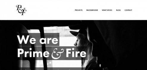
Prime & Fire
Prime & Fire uses multiple large scale images as backdrops for the site’s mission and presentation of their content. Instilling the design with a sense of dynamic creativity, and winning users over instantly.
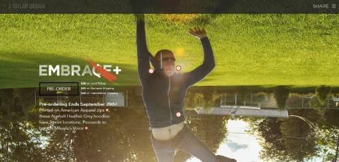
J Taylor design
J Taylor Design uses a large background image to highlight their cause by showcasing their hoodies for charity and directing users to where they can be printed.
Vita Frute Cocktails
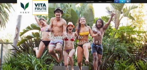
Vita Frute Cocktails uses big vibrant images of tropical locations as you scroll through the site. You can almost taste the cocktails via their picturesque pulling at your imagination!
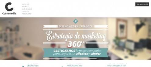
Customedia
Customedia takes a slightly different route by using a heavily blurred image as their background with clean, elegant typography on top creating a unique yet pleasing experience.
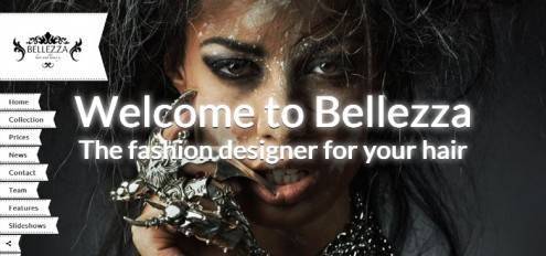
Bellezza
Bellezza use amazingly wild and stylish background images that perfectly conveys their unique and wild style to the user with all the boldness and flair you would expect from this brand.
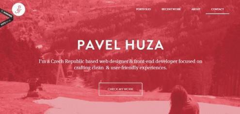
Pavel Huza
Pavel Huza‘s use of a muted, monochrome pink background offers a very calm and friendly feel for this site. Welcoming the user in with a warm and soft feel to the design.
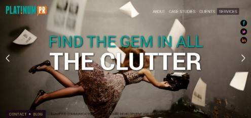
Platinum PR
Platinum PR uses bright, fun and quirky images with big bold typography layered over the top. Perfectly representing their unique style and playful nautre.
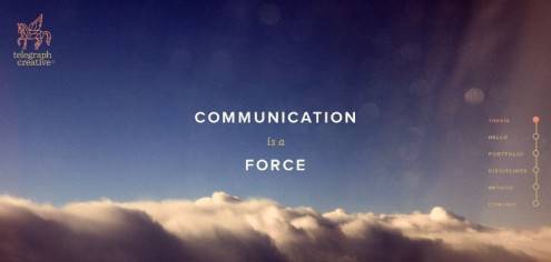
Telegraph Creative
Telegraph Creative uses a simple photograph of a clear sky above thick clouds. Couple this with the clean title and menu, not to mention the abundant white space, and this design denotes clear and open communication with ease.
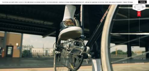
House: Kampania
House: Kampania uses large background images along with video that when combined create a site that captures the user’s attention making them want to go on an adventure.
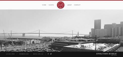
Evolution Bureau
Evolution Bureau uses a huge panoramic image as its background that you can scroll through a full 360 degrees. Really taking this idea of using large image backgrounds and evolving it. Pun intended, but it fits.
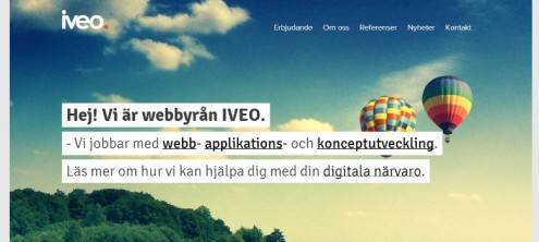
IVEO
iveo uses a large image background to sell the idea that their web agency can really take your web presence to new heights. The hot air balloons could also make some see that they are full of hot air as the old saying goes, but hopefully those are not the dots that get connected.
本文由 Jackchen Design 1984 作者:jackchen 发表,转载请注明来源!
