网页设计
30个超攒的单页网站创意设计
随着互联网这些来来的迅猛发展,浏览者已经被爆炸化发展的信息给埋没咯。网页设计师们也都在不断探索,用新的方式来提供内容。而单页网站在现代网页设计中也被越来越多的使用。因为这样的页面快速、干净、简单。而且可以做出各种美观和动画结合的创意效果。而这两年HTML5和jQuery的引进和快速增长。越来越多的让人惊讶的网站被人们创建出来。今天我们要分享的就是一些这样的超赞的网页。利用导航视觉差让简单的单页变得更加有活力。赶快看看下面的网站,去体验一些不一样的感觉吧!
1. Trionn Design
Having won several awards, Trionn Design’s one-page HTML5 website uses parallax scrolling to make it easier for users to navigate through the site. This responsive design uses attractive images to keep users engaged, and also incorporates some great CSS effects.
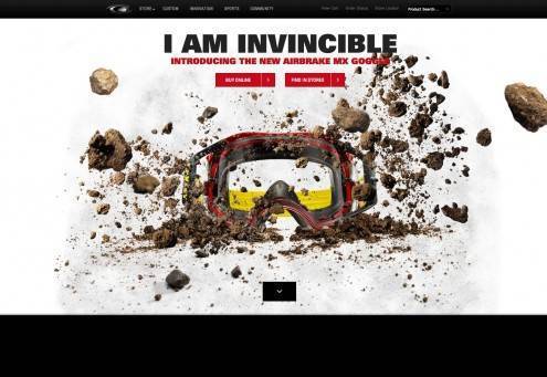
2. Oakley Airbrake MX
Oakley have created this entertaining and eye catching site, combining parallax scrolling and amazing photography to showcase the new Airbrake MX goggles in a unique way.
3. Scroll for your health
Not only is this site stunning but it also provides useful information on your ’5 a day’, encouraging visitors to eat more fruit. The site makes use of clever parallax scrolling for a bright, almost video-like feel.
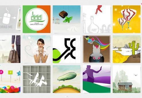
4. Laura Baffari
Graphic designer Laura Baffari has created a stunning interactive portfolio that uses horizontal scroll and touch swipe for smartphones and tablets. When entering the site you’ll see tiles displaying her work which can be scrolled through in any direction.
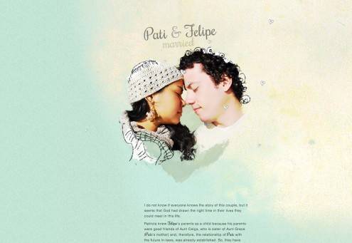
5. Pati & Felipe
This one’s for all the romantics out there. This has to be the most unique way to confirm your attendance to a wedding. A beautiful story of a couple who met many years ago, this site uses parallax scrolling with some great animation and inventive typography.
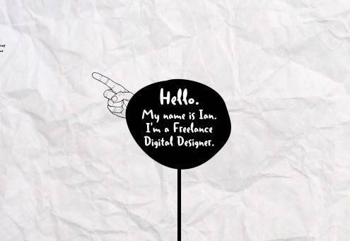
6. Ian James Cox
Another portfolio bound to provide you with inspiration, freelance digital designer Ian James Cox has created an inventive doodle effect one-page website based around the “Duffy Bold” font and the popular Scroll Path jQuery plugin.
7. Air Jordan 2012
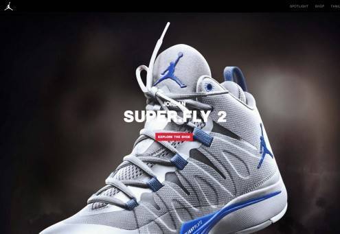
Footwear specialists Nike created a captivating website for the Air Jordan 2012. Built around the footwear itself, the site uses parallax scrolling to take visitors through the creation of the trainer and the materials used as it’s assembled.
8. My Pizza Oven
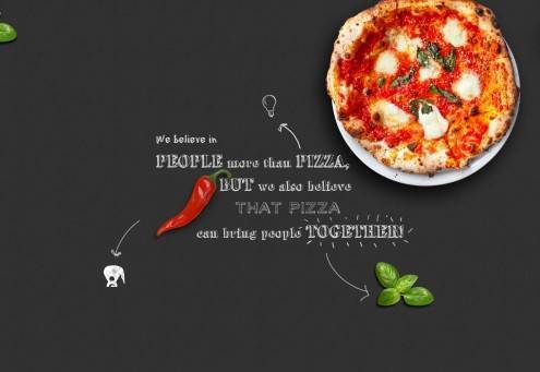
Pizza fanatic Renato has created this alluring site for his pizza party business. Not only does this site make you hungry but the use of graphical elements throughout the page adds a nice touch.
9. Marty.com
Created by Martin Ringlein, Design Manager at Twitter, this one page design is truly unique. Use the arrows at the bottom to set the presentation slideshows in motion and see what Martin has been up to since 1999. If you’re looking for inspiration for an original navigation, do check this site out!
10. Smart Phood
Smart Phood is a research project about how people eat. This colourful HTML5 one-pager has a unique scroll that gives it the ‘wow’ factor.
11. numéro10
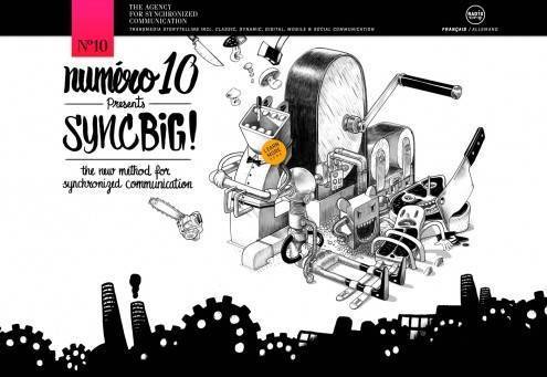
I can’t imagine how much work has gone into creating this one-page website. It uses parallax scrolling and loads of amazing transitions and graphic elements that you’re unlikely to see on any other site. Simply breathtaking!
12. Saucony Kinvara 3
An excellent interactive experience using parallax scrolling and amazing transitions and effects to present the complete journey of the shoe coming together.
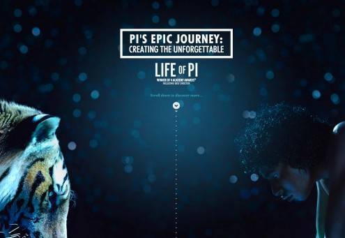
13. Pi’s Epic Journey
This one-pager is as epic as the movie itself. It’s a stunning HTML5 parallax scrolling site that takes a behind-the-scenes look at some of the greatest moments of the movie.
14. New Skoda Octavia
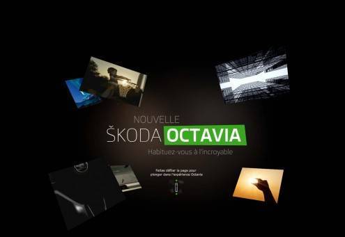
The new Skoda Octavia’s dedicated HTML5 website invites visitors to discover it through an immersive animated experience. This stunning one-pager uses parallax scrolling and a unique type of navigation that creates an engaging experience.
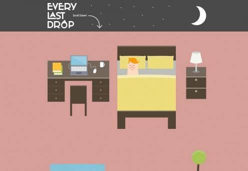
15. Every Last Drop
An informative website which takes an in-depth look at how much water the average person consumes every day in the UK. The site uses graphic elements and transitions to spark conversation on an important issue.
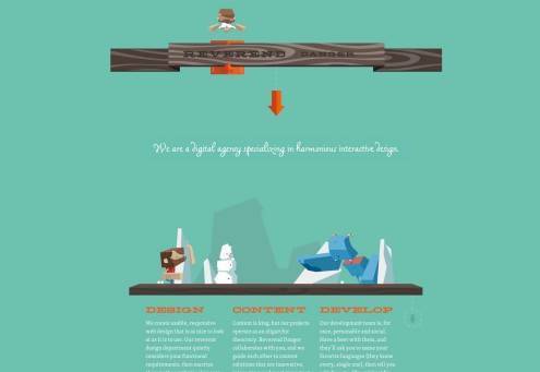
16. Reverend Danger
Stylistically similar to Minecraft, Reverend Danger uses a range of animation and CSS techniques to create a fun experience for visitors. This one-pager combines an interesting slider at the top where visitors can change the images from ‘reverend to danger’.
17. Festa Italiana
Festa Italiana is another fun website that uses bright colours and graphical elements that move as you scroll down.
18. Activate
Quench your thirst with this website by Activate. As you scroll down the site you are presented with clickable floating bottles. The site has some excellent transitions and effects throughout.
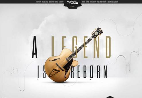
19. D’Angelico Guitars
D’Angelico guitars were embraced by many and remained popular until the 70′s. Now the legend is reborn with a stunning HTML5 one-pager that makes great use of sound and parallax scrolling to take you through the journey.
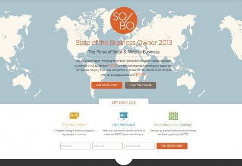
20. State of the Business Owner 2013
A unique take on the popular concept of the traditional infographic, this HTML5 one-page site present statistics from a report that reveals critical factors for small and midsize business success in 2013. Scroll down to see the transitions and effects that reveal the stats.
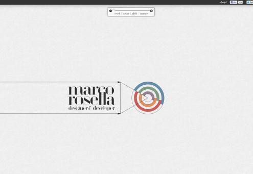
21. Marco Rosella
A fantastic one-page portfolio site in HTML5 with a zoomable user interface powered by SVG.
22. Jules Bassoleil
Jules Bassoleil’s single page portfolio has an amazingly logical and effective navigation with the graphics jumping out at you.
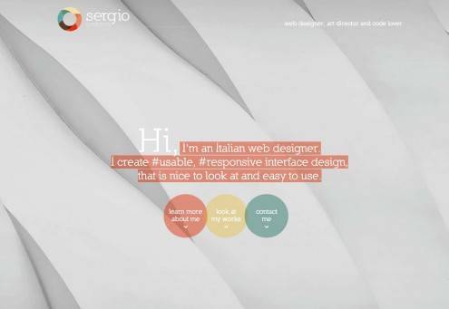
23. Sergio Pedercini
Italian web designer Sergio Pedercini has created an elegant site to display his portfolio. The bright colours and the bouncing navigation make it attractive and easy to use.
24. VonDutch
Fashion label Von Dutch’s use of parallax scrolling adds a sense of movement to its story. Icons and images move in and out of place as you scroll down the page, providing a fluid experience.
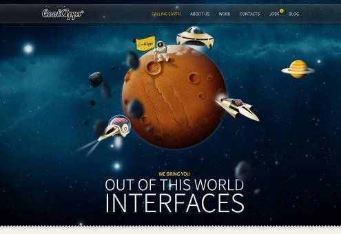
25. CoolApps
A simple yet attractive HTML5 one-pager that uses animation to provide a great floating effect.
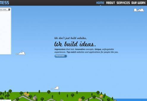
26. Pixelmess
Horizontal scrolling is quite common on creative agency websites, and Pixelmess’s site is an example of it working particularly well. The combination of retro fonts and illustrations makes you feel like you’re playing an old school video game which is even more engaging.
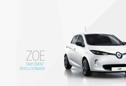
27. Renault Zoe
Renault uses a combination of parallax scrolling, audio and video to create an interactive and amazing experience for visitors.
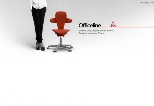
28. Officeline Lei
This is one of the best product presentation sites I’ve seen lately. The site use of parallax scrolling to present swivelling chairs specifically designed for women.
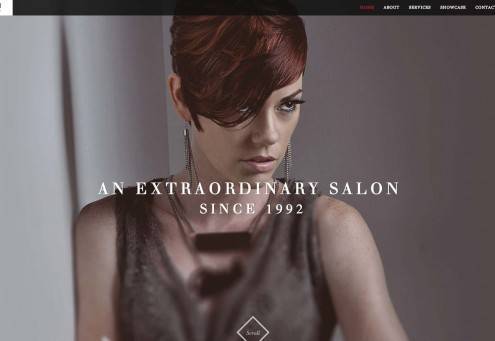
29. All-N-1 House of Beauty
This responsive HTML5 one-pager features a fluid layout that includes several interactive elements and animations to make it more engaging.
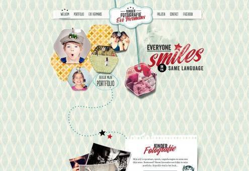
30. Kinderfotografie Evi Hermans
Children’s photographer Evi Hermans has created this fun and playful one-page website. Not only are the photos lovely, but this beautiful site is made even more interactive through the use of animations.
本文由 Jackchen Design 1984 作者:jackchen 发表,转载请注明来源!

