网页设计
20个完美简约的网页设计展示
关于网页设计,每个人都有不一样的设计观念。即使是你面对的客户也一样,甚至可能时刻都在改变他的想法,让你一遍又一遍的修改界面。这时候你得要有一定的设计心理学,首先项目开始前就制定要设计方向,之后要把自己的设计理念灌输到客户的大脑里,让TA理解你的设计观念。这说起来简单的几句话,做起来可是一点不简单的。你需要不断的项目中学会交流和设计的结合。有的客户会让你精疲力尽的(相信我:D)。下面给大家展示的是20个简约的艺术设计如何运用到网页中的案例。这些站点将简约完美的呈现,让视觉更有冲击力。
Astheria
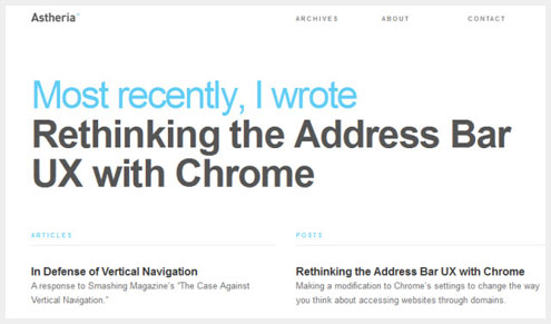
The personal website for a designer’s writing excerpts. A left hand column for articles and right hand column for posts keeps content organized and up-to-date, with the most recent selections appearing first.
Visit Astheria →
A Working Library
Organized like a blog and styled in a minimal book-like way. The simple lines separating items are the only real design elements within the page.
Visit A Working Library →
Because Studio
Effective example of what large typography and a splash of accent color can do.
Visit Because Studio →
Benny Roth
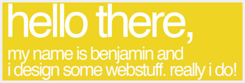
One bold web page background color is all that’s necessary to grab your attention and carefully balanced out by simple graphics and tasteful writing.
Visit Benny Roth →
Cade Martin
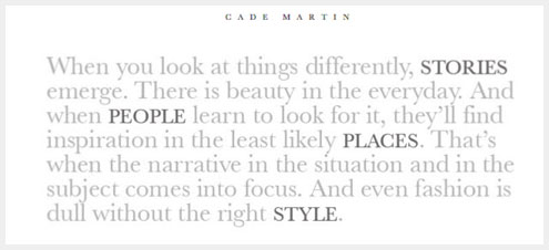
Unexpected minimalism: The photography website of Cade Martin, who forgoes images entirely and focuses only on a paragraph of light grey text, so light it almost blends into the background.
Visit Cade Martin →
Dan Joe Design
Dan Joe Designs’ signature graphic makes two simple statements: The first, and most important, emphasizes the quality of the designer’s work, and secondly it subtly directs your eye towards the navigation.
Visit Dan Joe Design →
Fat Man Collective
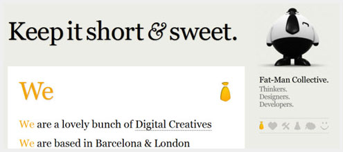
The simple list of company attributes, services and projects is sometimes all that’s needed to put your message across.
Visit Fat Man Collective →
Fell Swoop
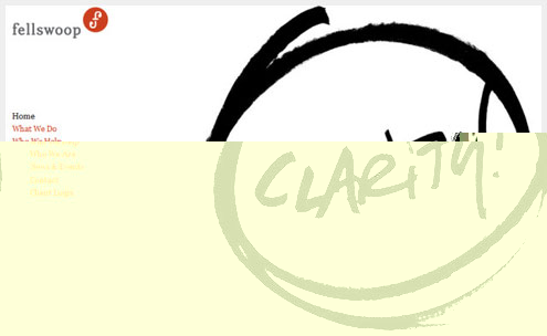
One circled “clarity” graphic dominates the website, making the point that this is what you’ll achieve through working with Fell Swoop. The circled word theme continues throughout other sections of the site bringing a uniformity to its minimal design.
Visit Fell Swoop →
Haikavanian
This artist’s website looks like a blank canvas…that is, until you roll the mouse over the boxes and the empty spaces are filled with images.
Visit Haikavanian →
Kyle Standing
Kyle Standing is a great example of a TumbleBlog that tracks the writer’s contributions over several different social networking services. A minimalist design only serves to highlight the innovating and intriguing idea in itself.
Visit Kyle Standing →
Martha Kelly
A blog dedicated to minimalist design keeps to its guiding aesthetic with a two-columned web page template. Images on the left, text on the right, and no other distracting element to be seen.
Visit Minimalissimo →
Network Osaka
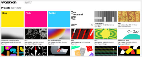
Network Osaka has a large quantity of information, in the form of a timeline, all compressed and streamlined in a minimal manner.
Visit Network Osaka →
New Simplicity
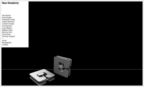
Minimalist in the extreme: an entirely black background color contrasted against the white prototypes of simple design. A hidden drop down menu provides the only access to other pages – each of which are formatted in the same minimal perfection.
Visit New Simplicity →
Post Machina
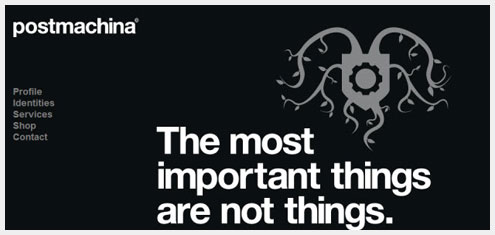
Postmachina highlights their name and motto in white. All the rest, including a logo, is bathed in a medium shade of grey that fades into the darker grey of the web page background color.
Visit Post Machina →
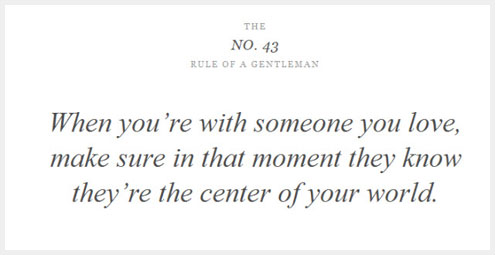
The Rules of a Gentleman
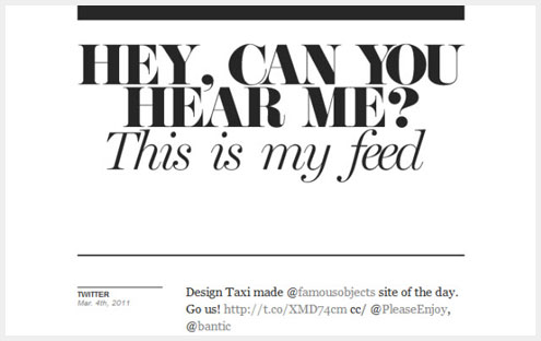
Striking words require no frills 😉
Visit The Rules of a Gentleman →
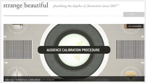
Strange Beautiful
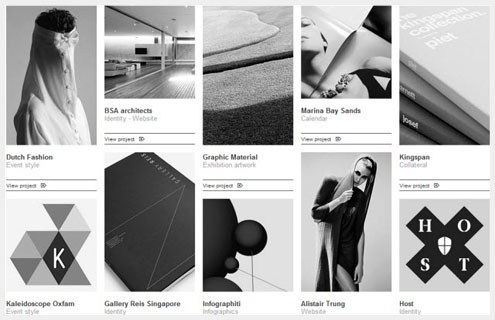
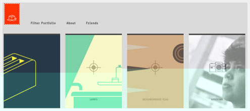
The Strange Beautiful homepage images are displayed in a grid format, with transparent grey overlays creating a sense of depth and layering.
Visit Strange Beautiful →
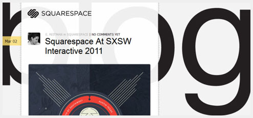
Squarespace
Minimal doesn’t have to be boring. Squarespaces features a transparent overlaid graphic, deliberately set off-center and lined by ruler markings. All of the minimal design elements seem to cleverly point you towards the content.
Visit Squarespace →
Toko
Toko has a simple and perfectly ordered grid made all the more interesting through its off-set lines and shapes. The minimal design redirects your focus to the content.
Toko →
Visualbox
Visualbox has opted for a minimal website that echoes its name and philosophy, so that all of your focus is on their previous work and projects.
Visit Visualbox →
Links: http://speckyboy.com/2011/03/09/20-perfect-examples-of-minimalism-in-web-design/
本文由 Jackchen Design 1984 作者:jackchen 发表,转载请注明来源!
